CI
Introducing FITI Testing & Research Institute's CI: Building a Safe and Sustainable World
Design Concept(Symbol Mark)
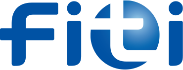
The symbol mark uses a traditional blue color, symbolizing trust and reliability, to emphasize the meaning and values inherent in FITI Testing & Research Institute. The name of the institute is represented in lowercase letters ("fiti") with circular and curved forms, creating a flexible, creative, and dynamic image that adapts actively to changing times.
The lowercase "t" extending in four directions from the blue sphere represents the institute's identity as a testing and certification organization (Testing) and symbolizes communication between clients (i) and Researchers (i). At the same time, it signifies leading new changes and trends while advancing globally with innovative testing and certification solutions.
Logotype
The logotype conveys the identity of the institute and ensures consistency with the symbol mark. It is presented in three variations: Korean, English, and Chinese.
Signature
The signature combines the core elements of the CI—the symbol mark and the logotype—into horizontal, vertical, and other arrangements based on specific guidelines. Appropriate combinations can be selected and applied depending on the layout or requirements of the medium.
Horizontal


Vertical


Symbol-emphasized


Exclusive Colors
- PANTONE 286 C
- C100 M66 Y0 K2
- R0 G82 B163
- #0052a3
- C36 M0 Y6 K0
- R170 G220 B238
- #a6daec
- PANTONE Cool Gray 8 C
- C0 M0 Y0 K70
- R113 G112 B113
- #717071
- PANTONE 3005 C
- C85 M50 Y0 K0
- R0 G117 B201
- #0075c9
- PANTONE 2985 C
- C59 M0 Y6 K0
- R92 G196 B232
- #5cc4e8
- PANTONE 631 C
- C70 M14 Y22 K0
- R56 G167 B192
- #38a7c0
- PANTONE 871 C
- C55 M55 Y75 K0
- R130 G115 B80
- #827350
- PANTONE 877 C
- C0 M0 Y0 K40
- R180 G180 B180
- #b4b4b4